Brief
Evolve a frozen-food brand's visual identity to move beyond its niche health-food perception and into everyday appeal, balancing its wholesome, ingredient-first roots with a bolder, more playful aesthetic to connect with busy young families.
Client
A better-for-you frozen food brand rooted in organic, stone-milled whole grains, real ingredients, and a refreshingly honest approach to feeding busy families.
Services

The situation
What challenge was our client facing?
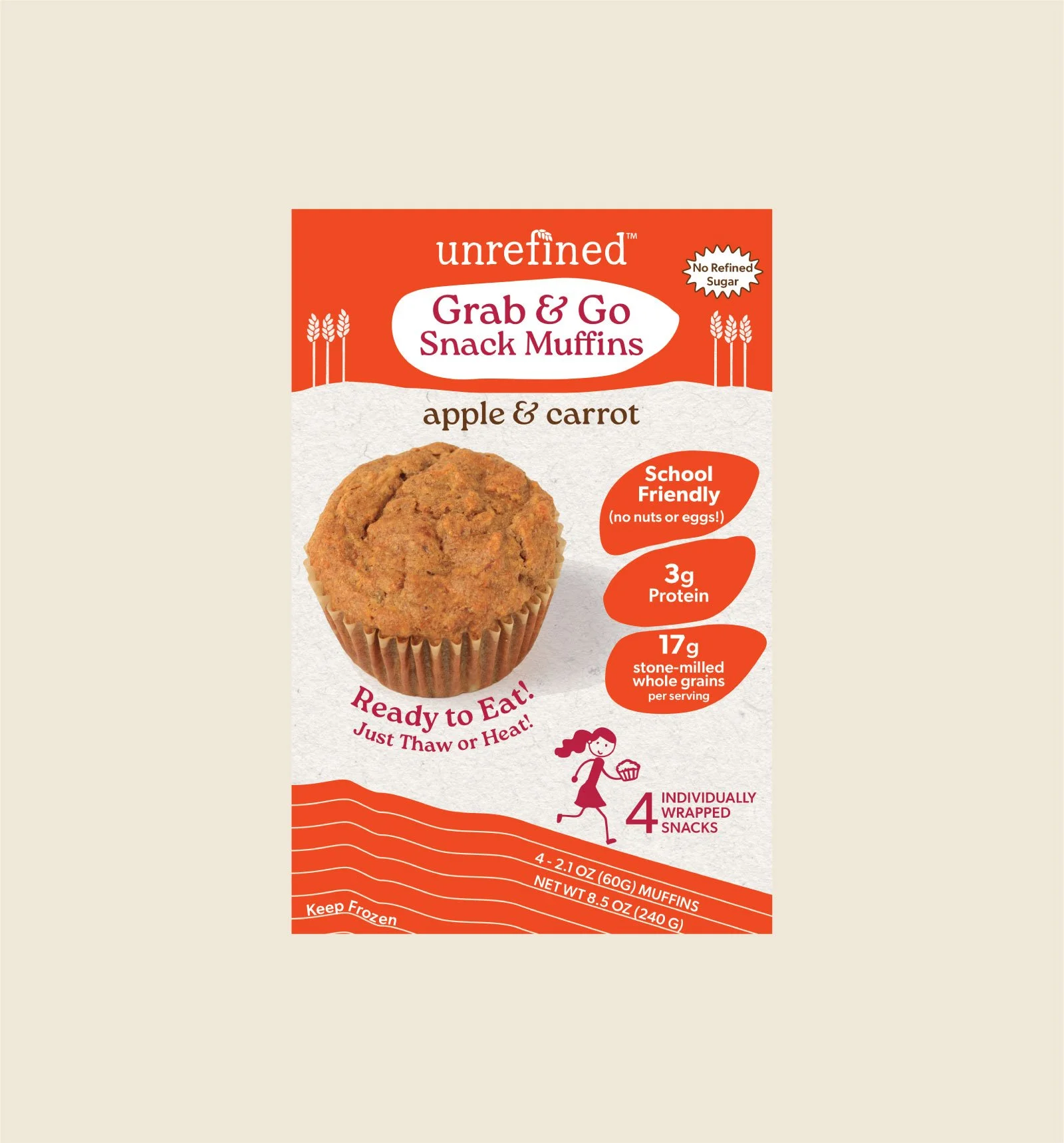
Unrefined Foods had a devoted following of busy parents and strong product credibility, but its visual identity still read as niche health food. The brand needed to move beyond typical "organic aisle" cues and appeal to a broader, design-conscious family audience, without losing the honesty and trust that built its loyal base.
Before
After
The action
What steps did you take to help them get there?
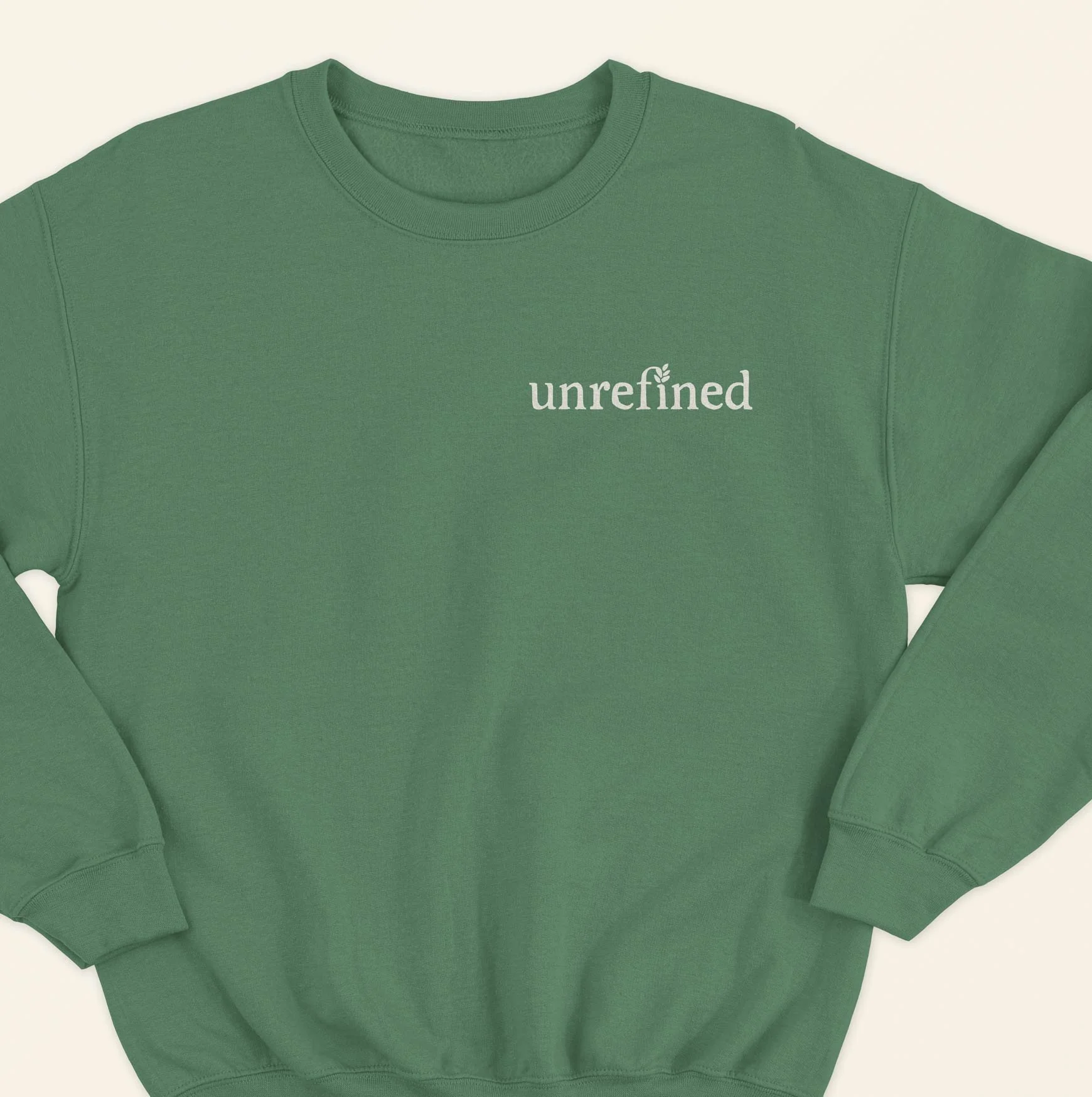
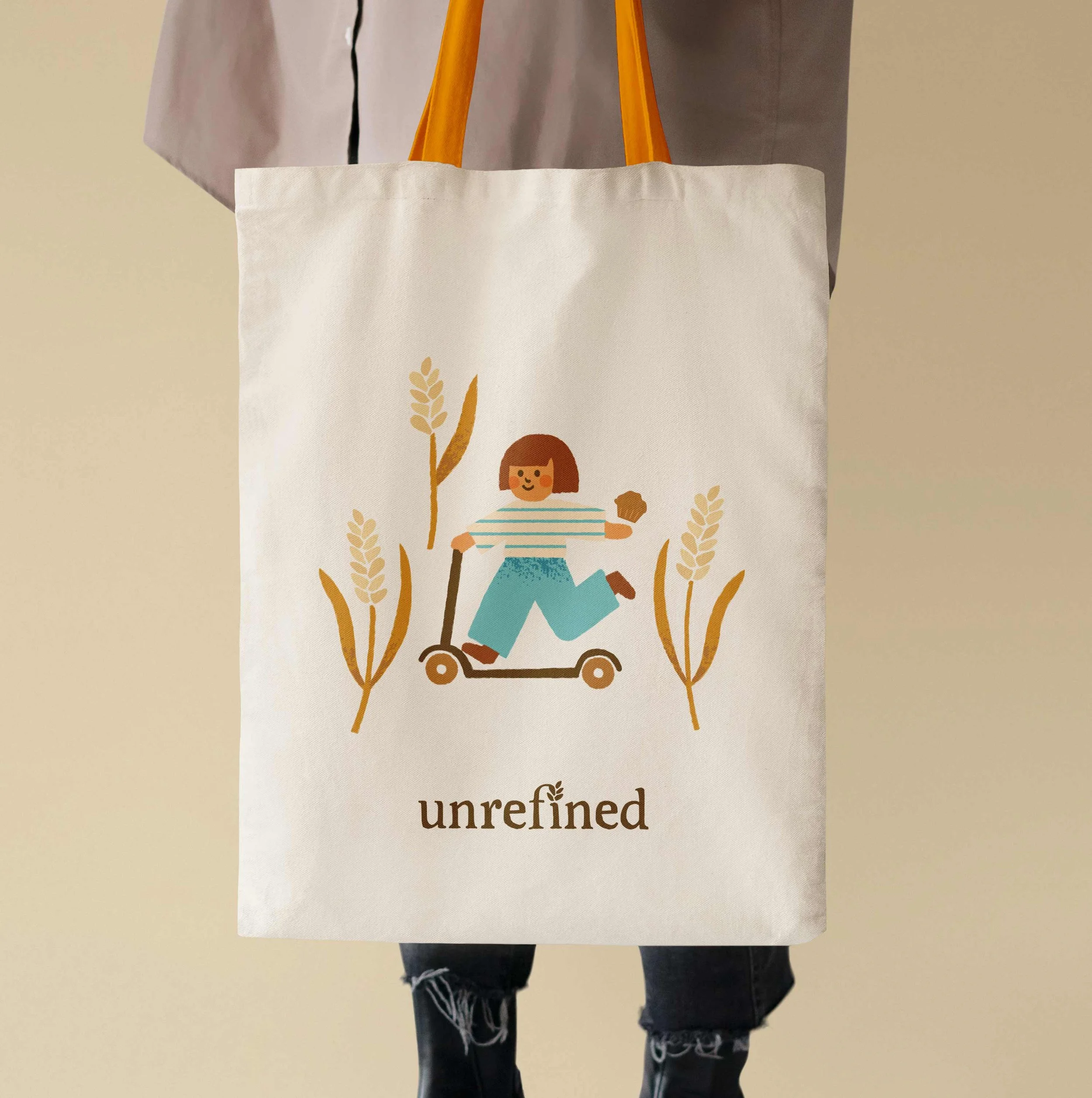
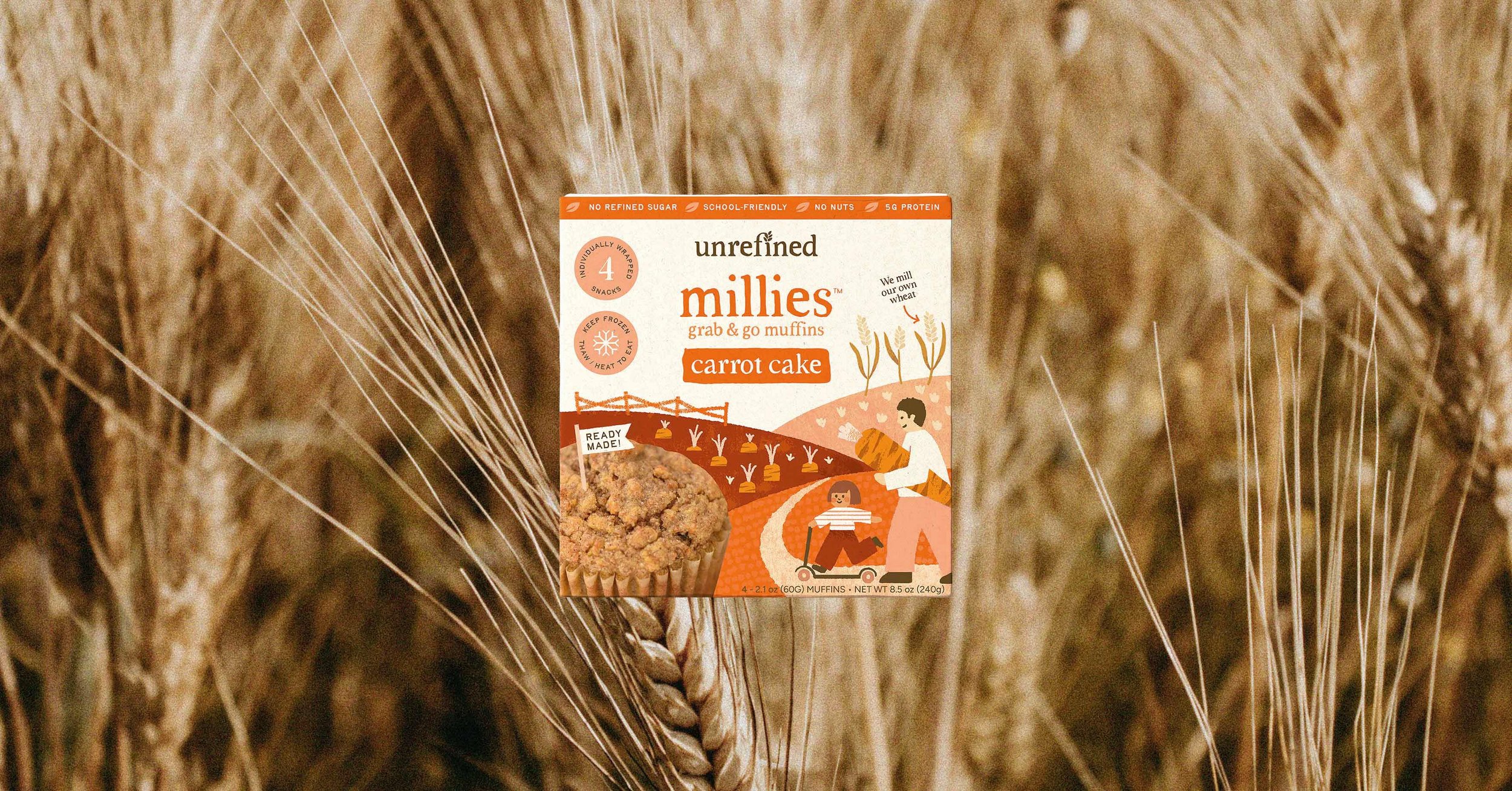
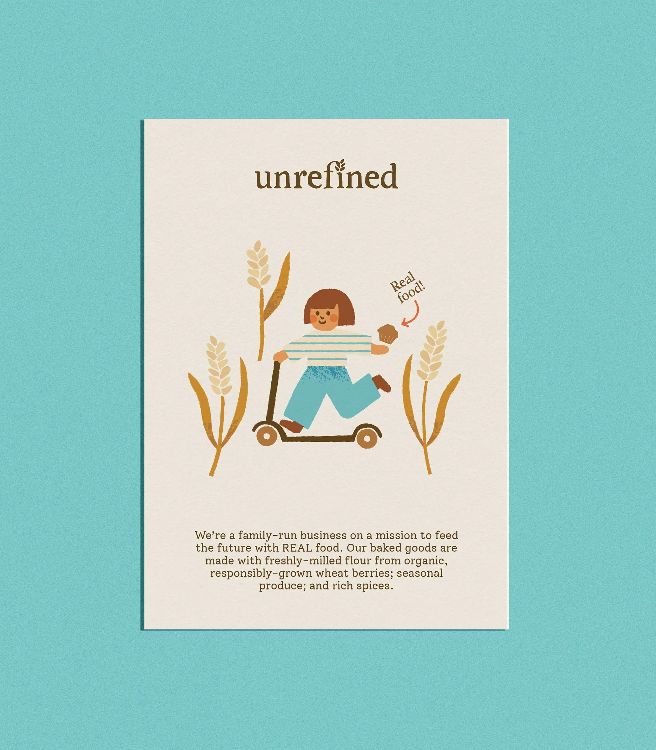
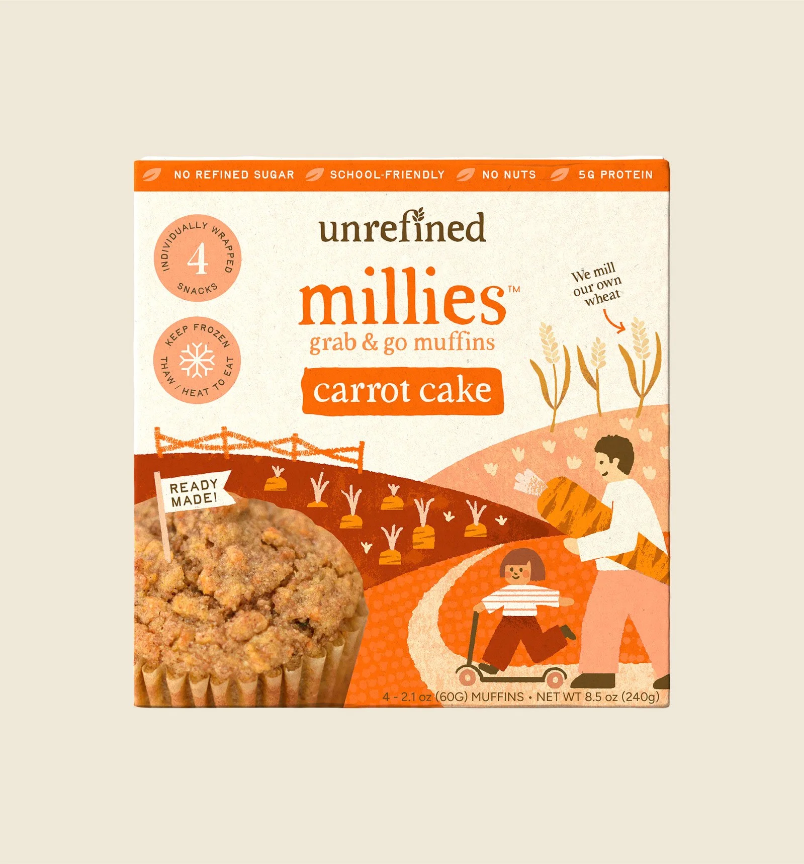
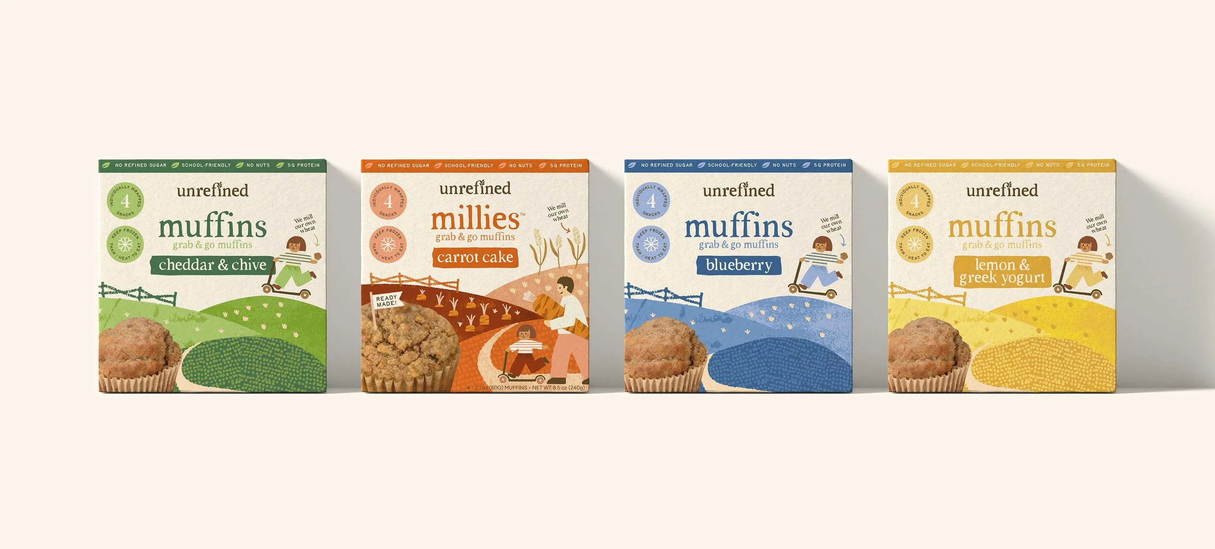
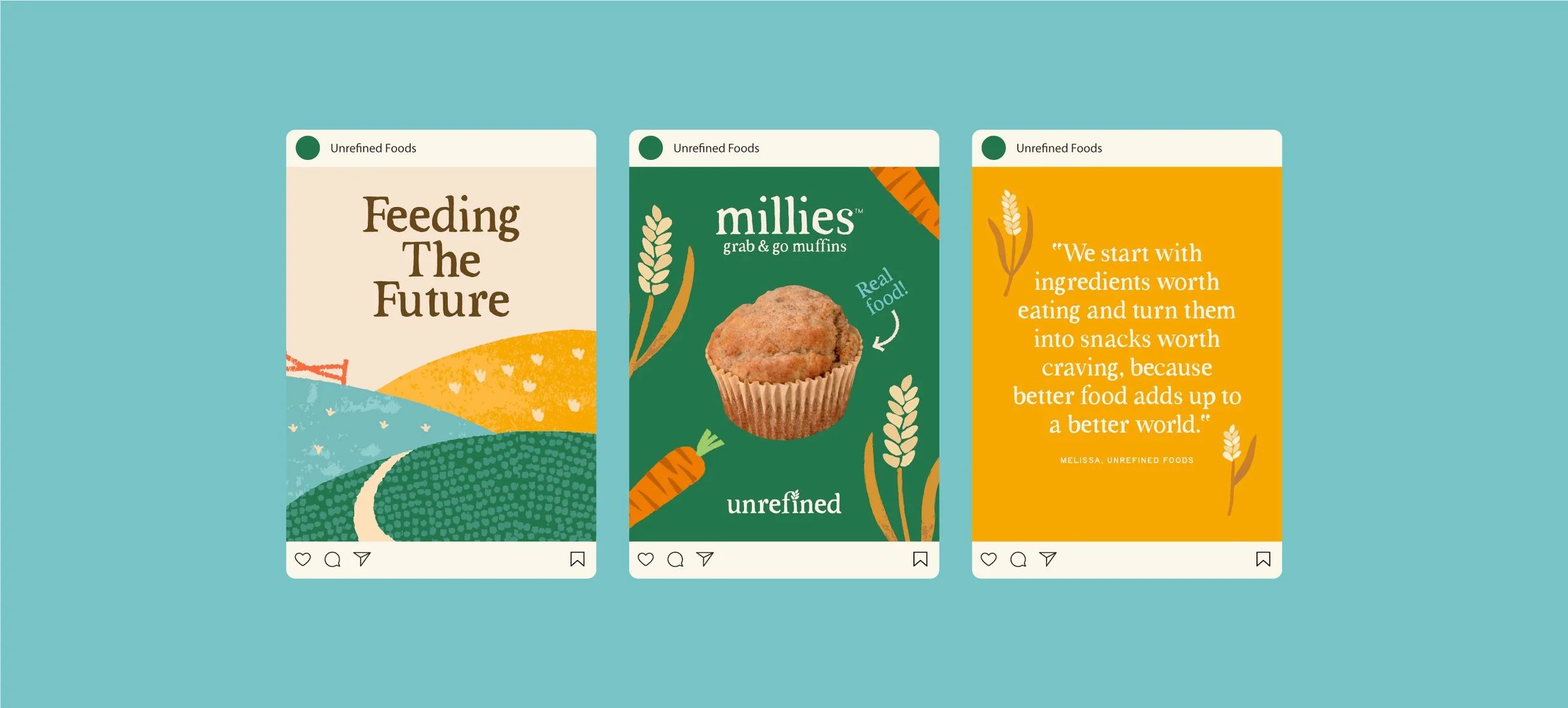
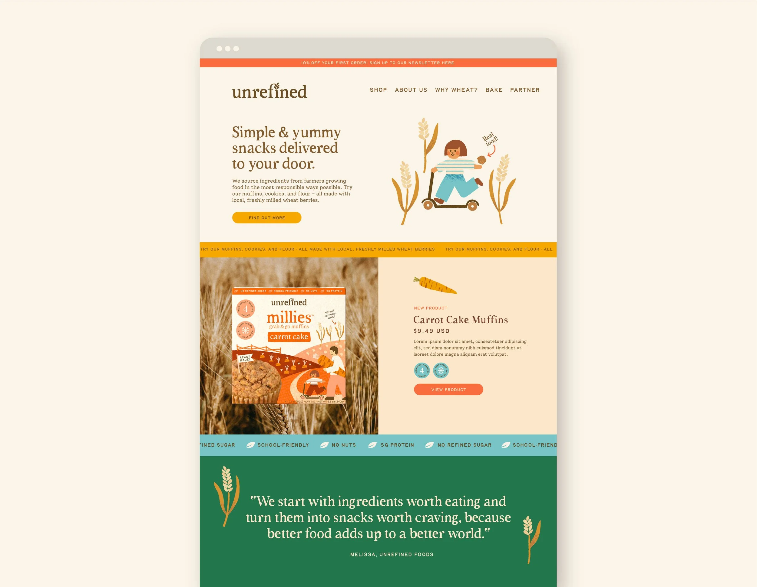
As part of a Start-Up project, we refined the brand from the ground up, developing a more confident and contemporary identity system. This included a clearer messaging hierarchy, more considered typography, a warmer, more “foodie” colour palette, custom illustrations and greater consistency across the range.
Natural textures and subtle cues to whole-grain ingredients were retained, but distilled into a more intentional, playful visual language designed to stand out on shelf and connect with busy families.
The Result
What was the final result?
The new identity positions Unrefined Foods more confidently within the better-for-you frozen food space, balancing its organic roots with a modern, design-led aesthetic. The refreshed system improves shelf presence, strengthens brand recognition, and creates a more engaging experience for both existing customers and a broader, style-conscious family audience.