Brief
Evolve a much-loved brand’s visual identity to move beyond its niche health-store perception and into broader appeal, balancing its organic roots with a more sophisticated, modern aesthetic to engage a younger audience.
Client
A forward-thinking chocolate brand rooted in organic ingredients, plant-based craft, ethical sourcing, and a more mindful approach to indulgence.
The situation
What challenge was our client facing?
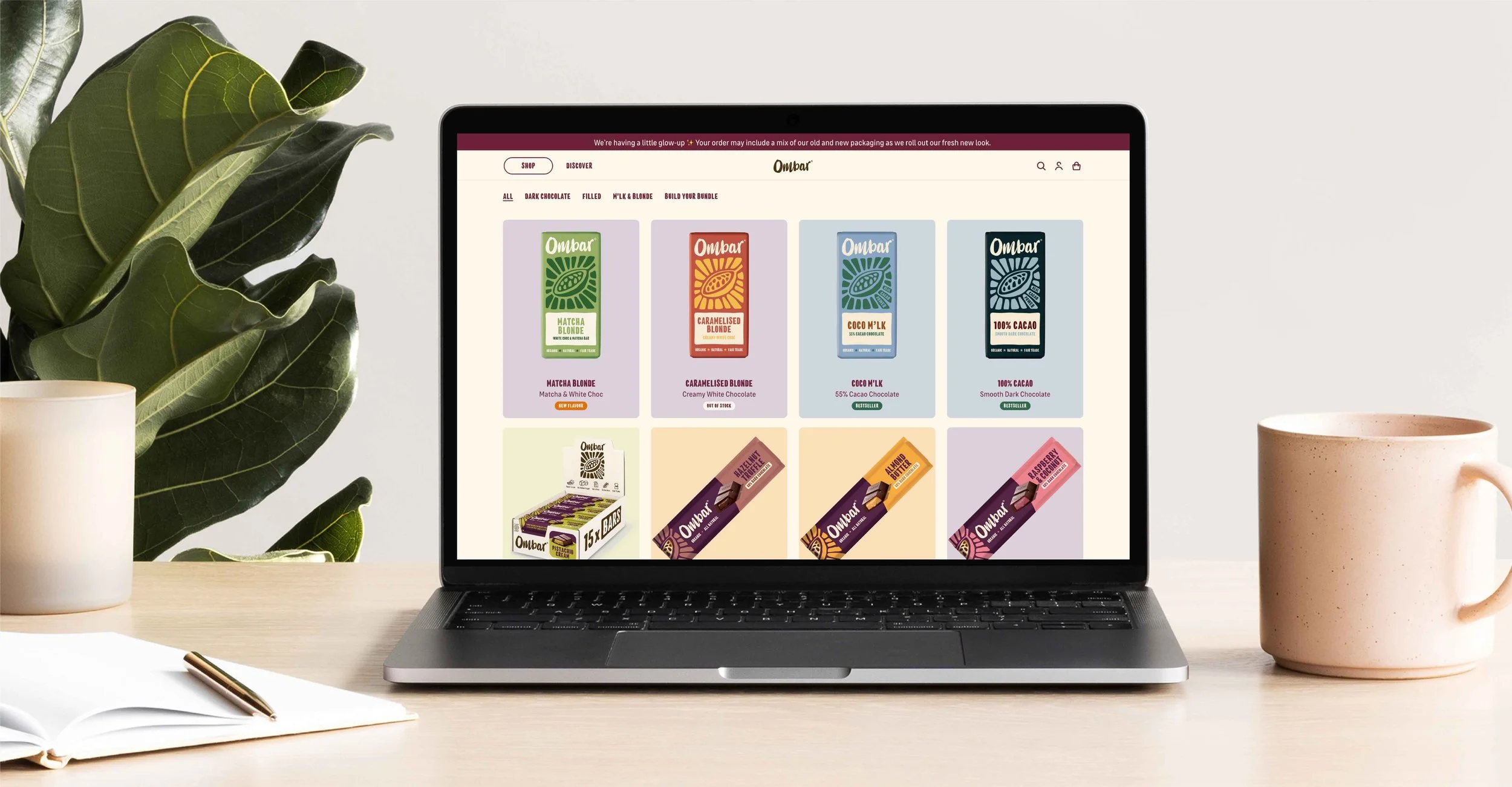
Ombar had strong ethical foundations and a loyal following, but its visual identity no longer resonated with the customer base. The brand needed to evolve beyond the typical cues of the organic category and appeal to a more design-conscious, mainstream audience, without losing its integrity or recognisability.
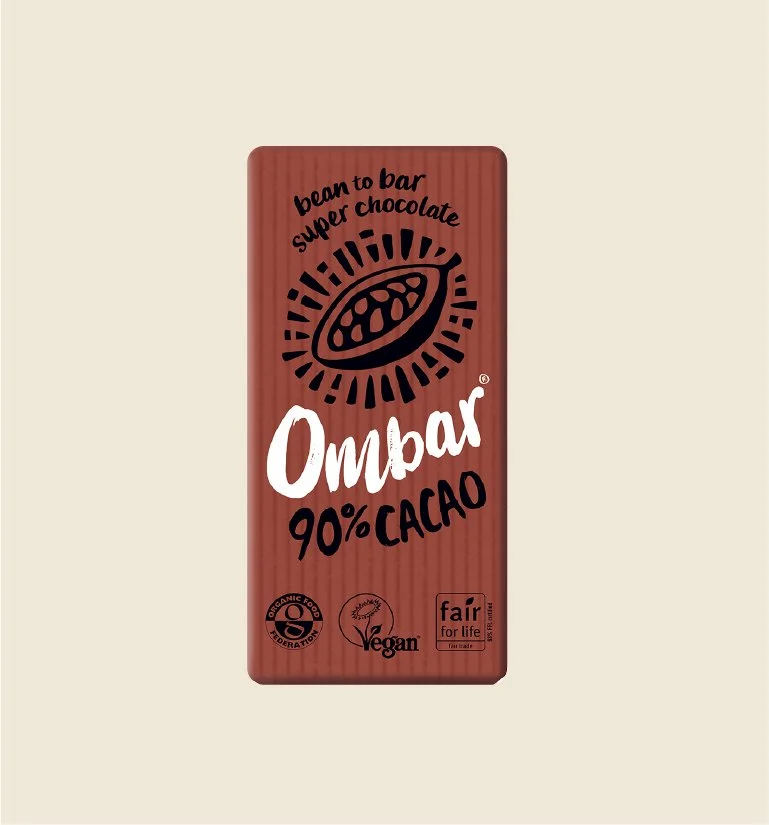
Before
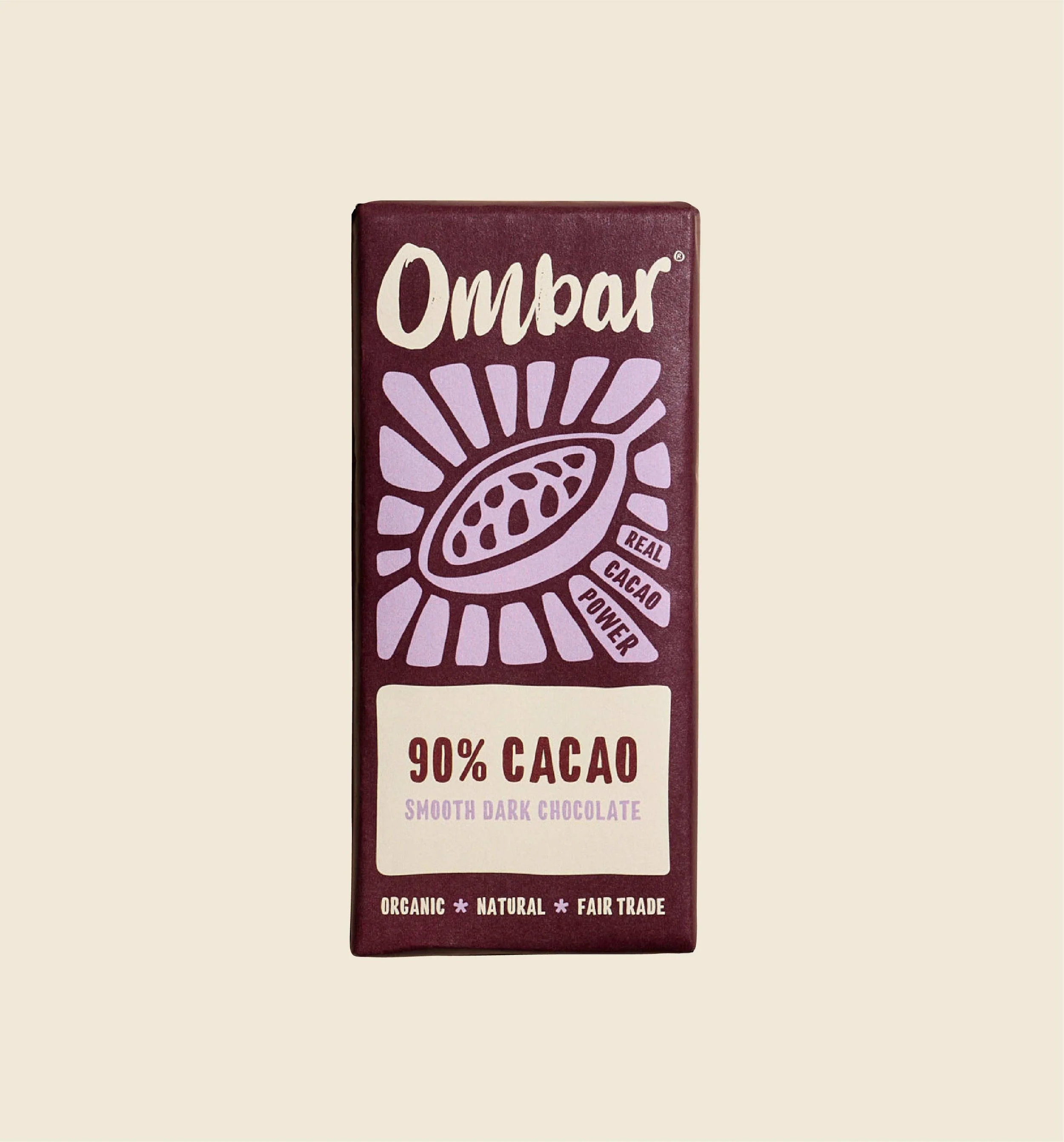
After
The Task
What outcome were they hoping to achieve?
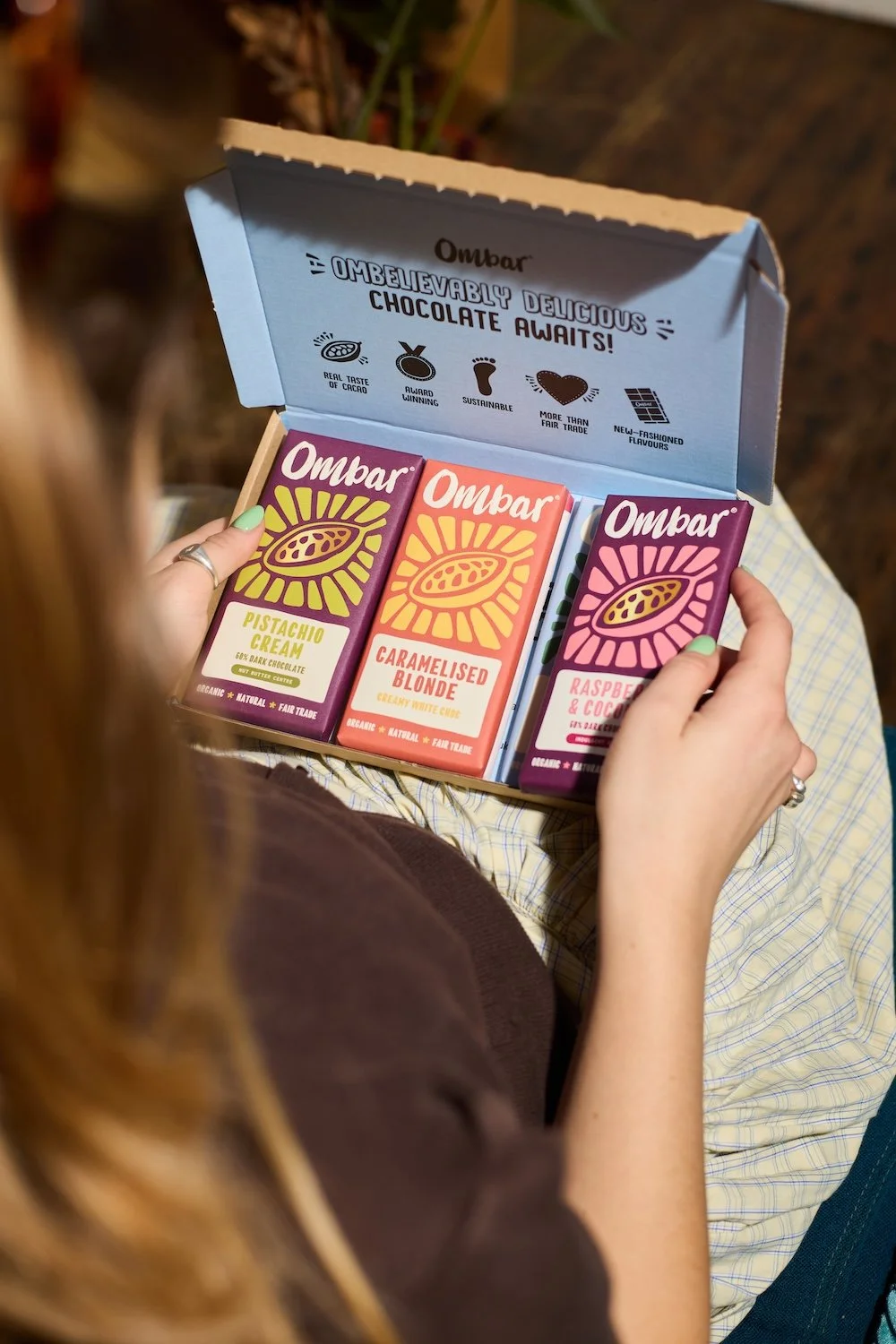
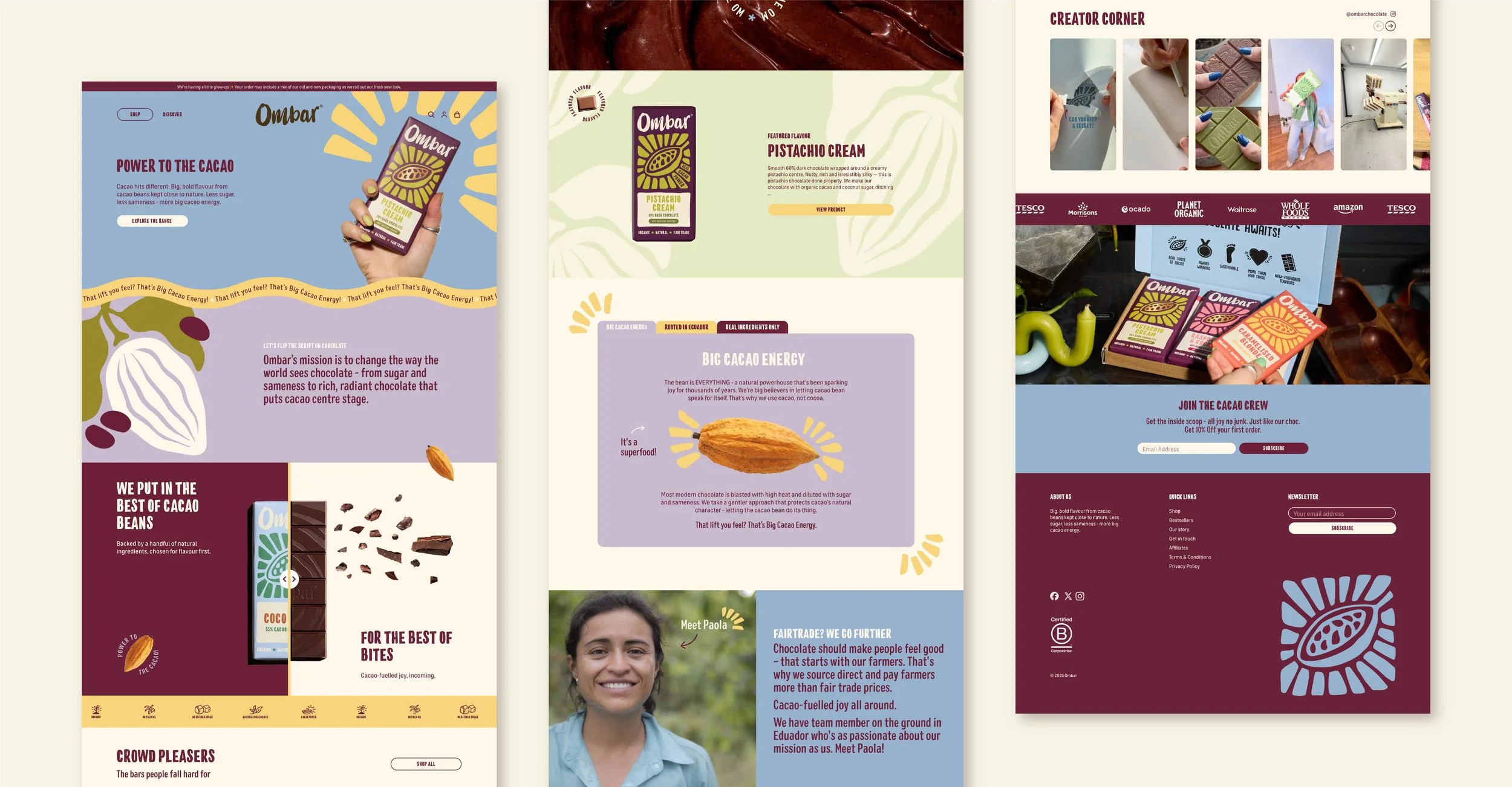
To create a more confident, modern expression of Ombar, enhancing shelf appeal while staying true to its organic and plant-based ethos. To redesign the website to improve conversions whilst telling the brand story and showcasing the brand world.
The action
What steps did you take to help them get there?
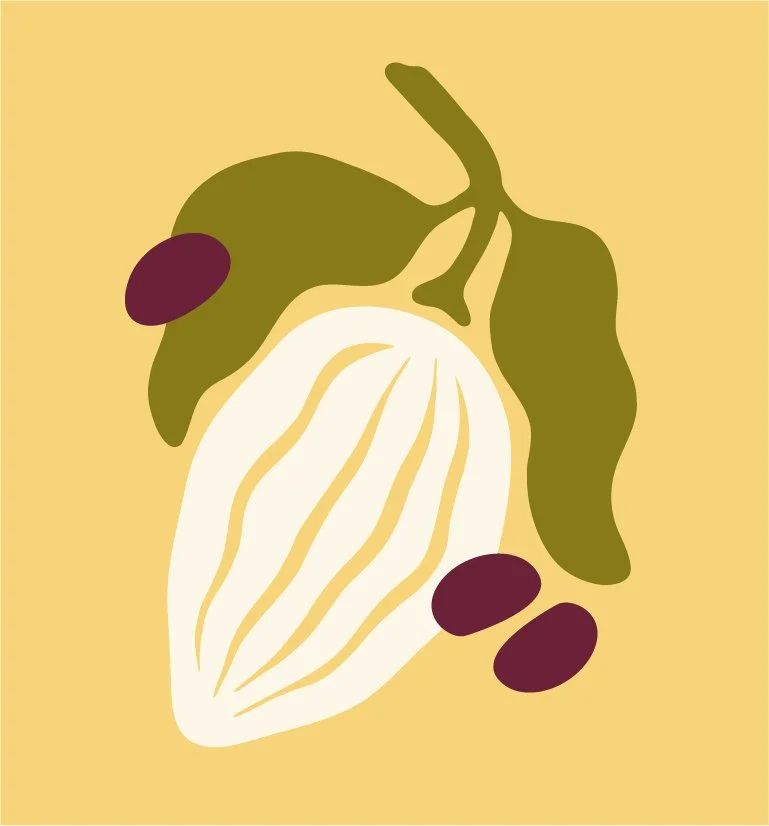
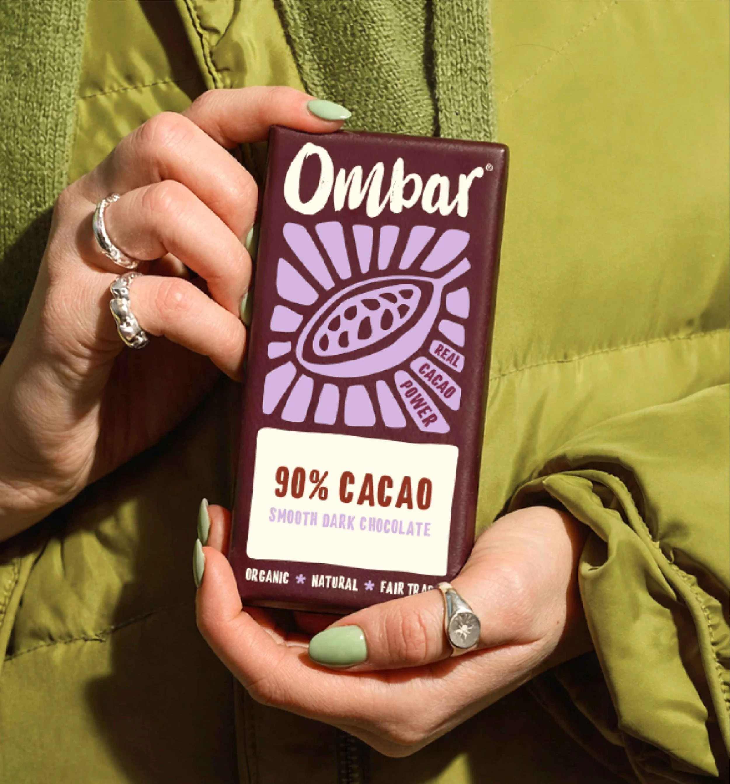
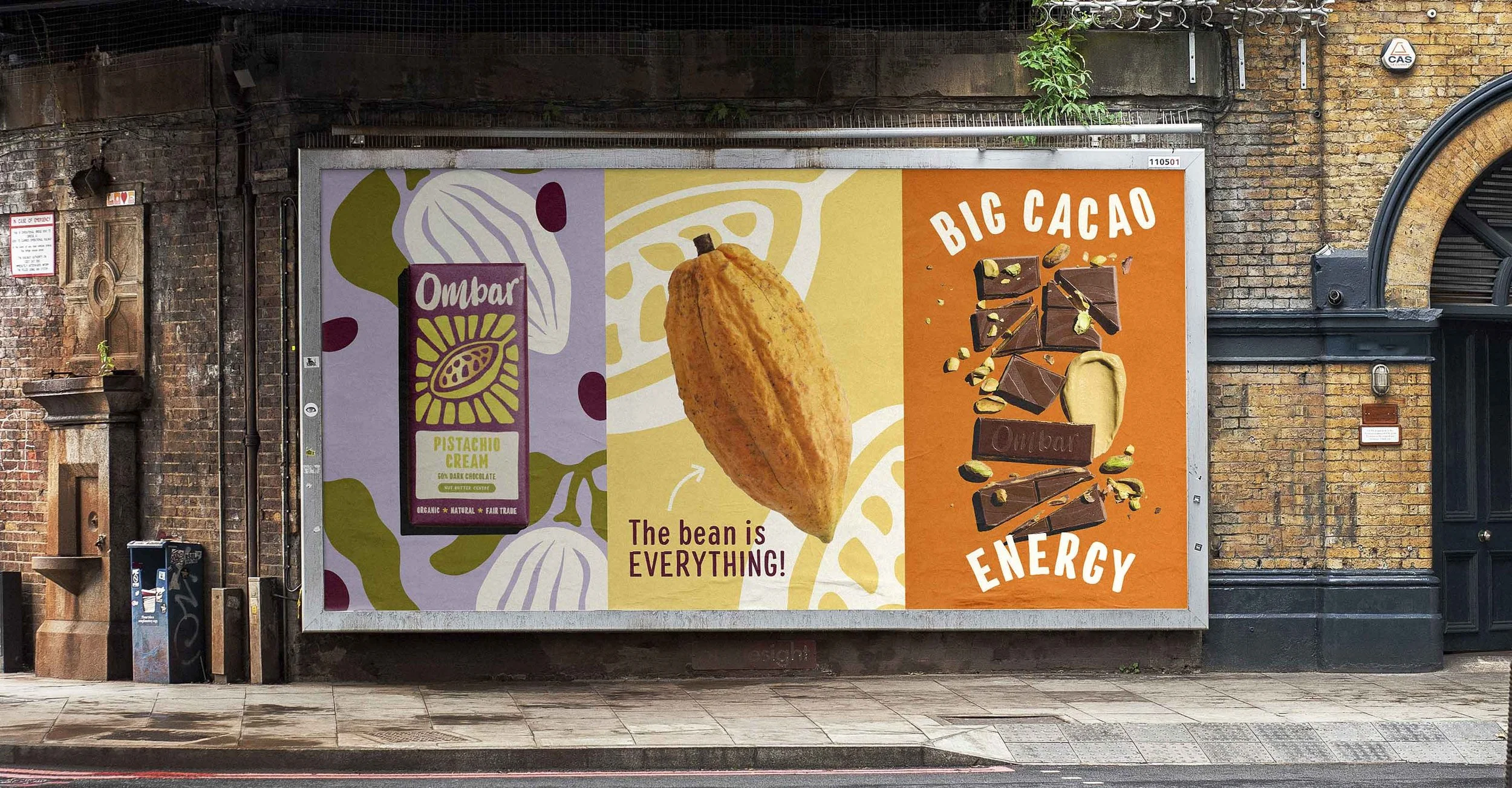
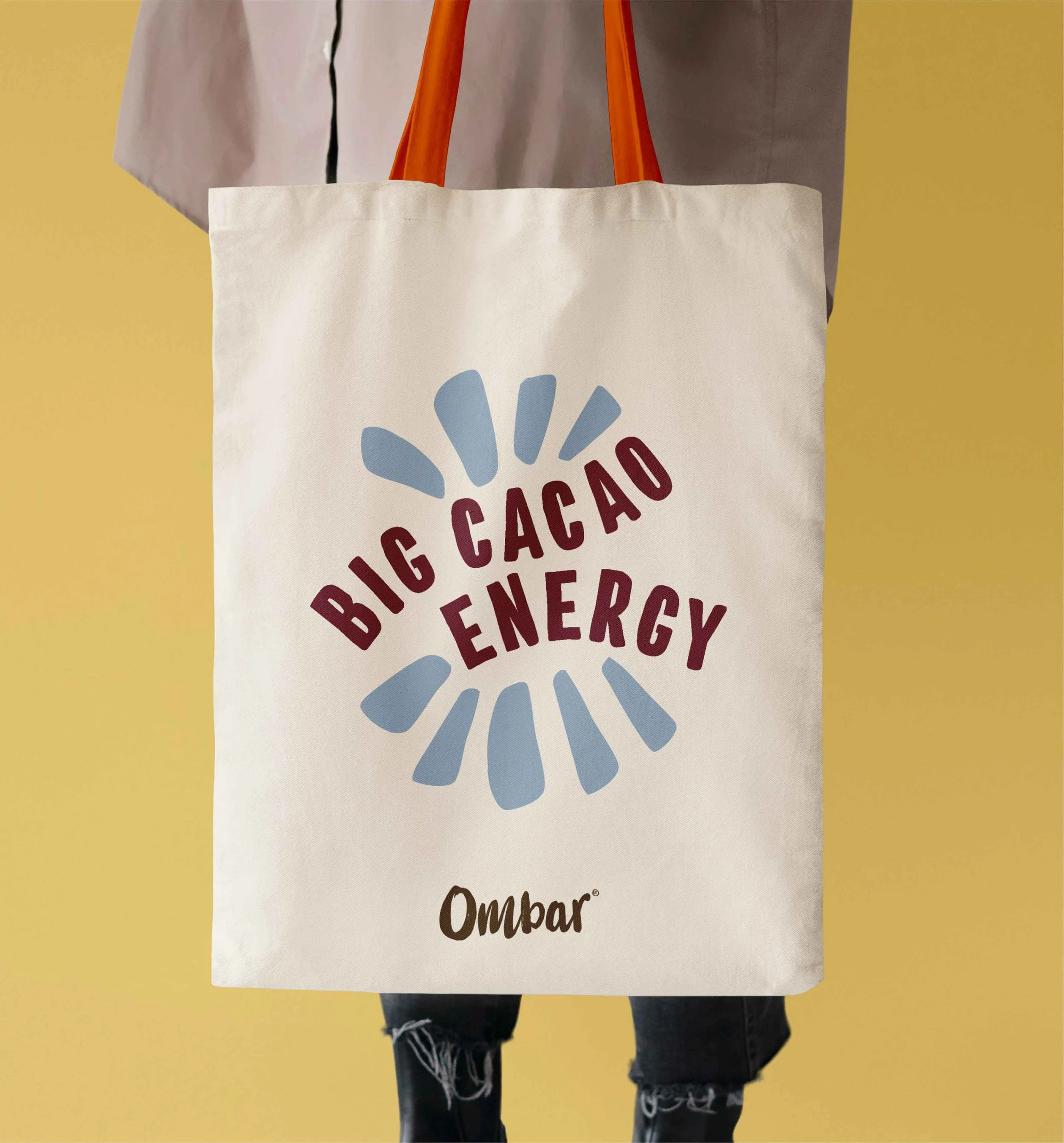
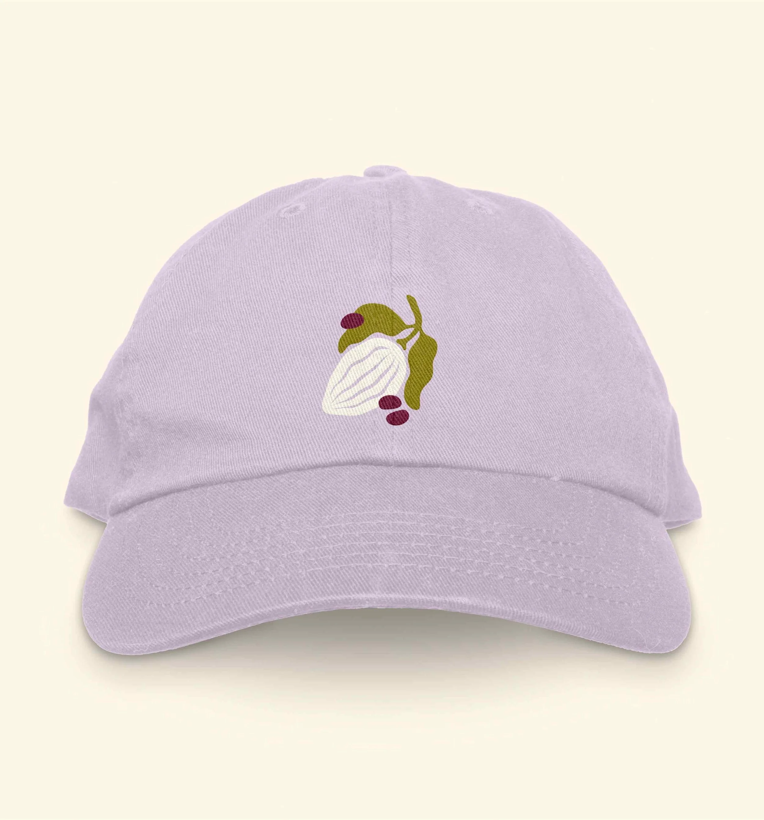
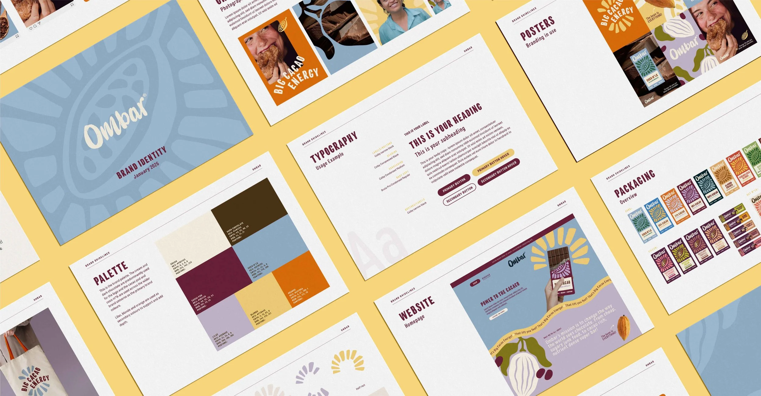
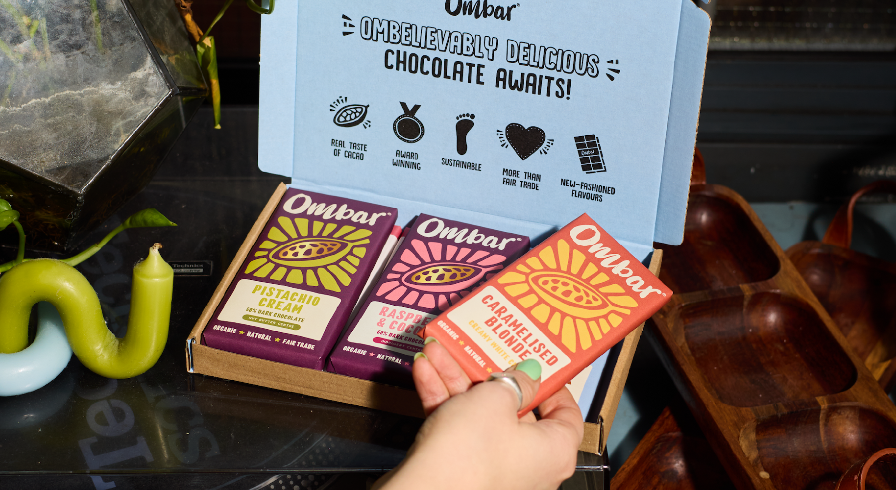
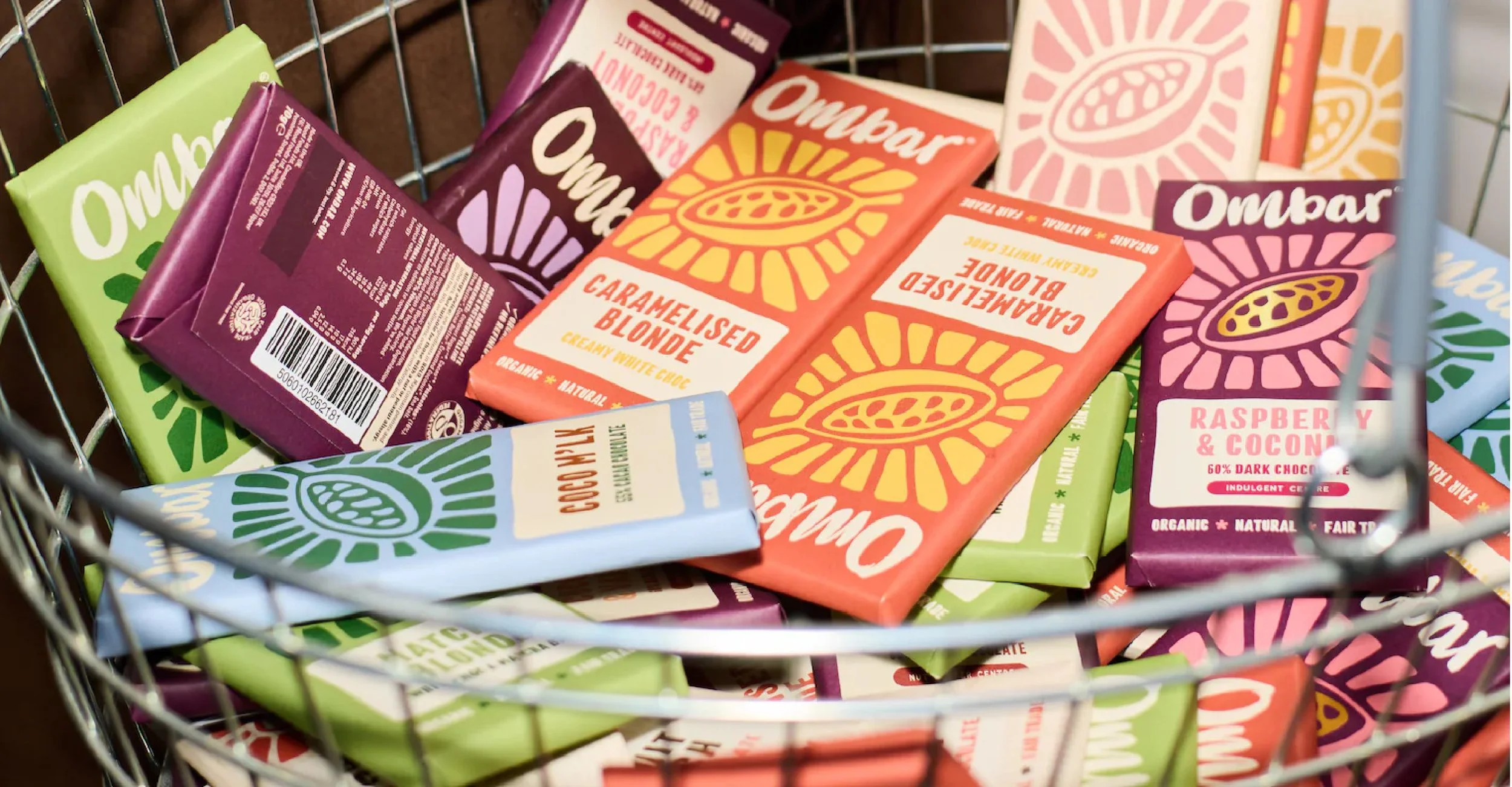
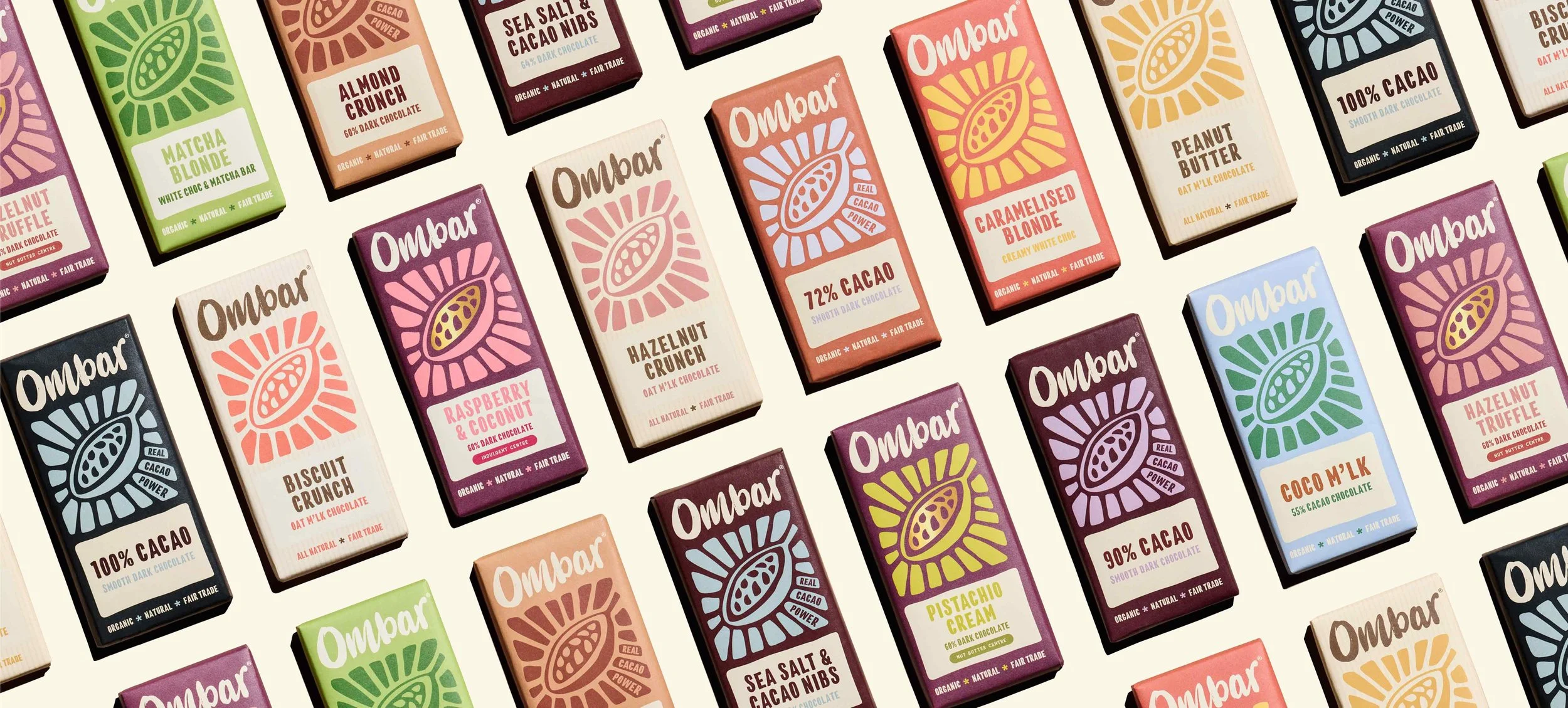
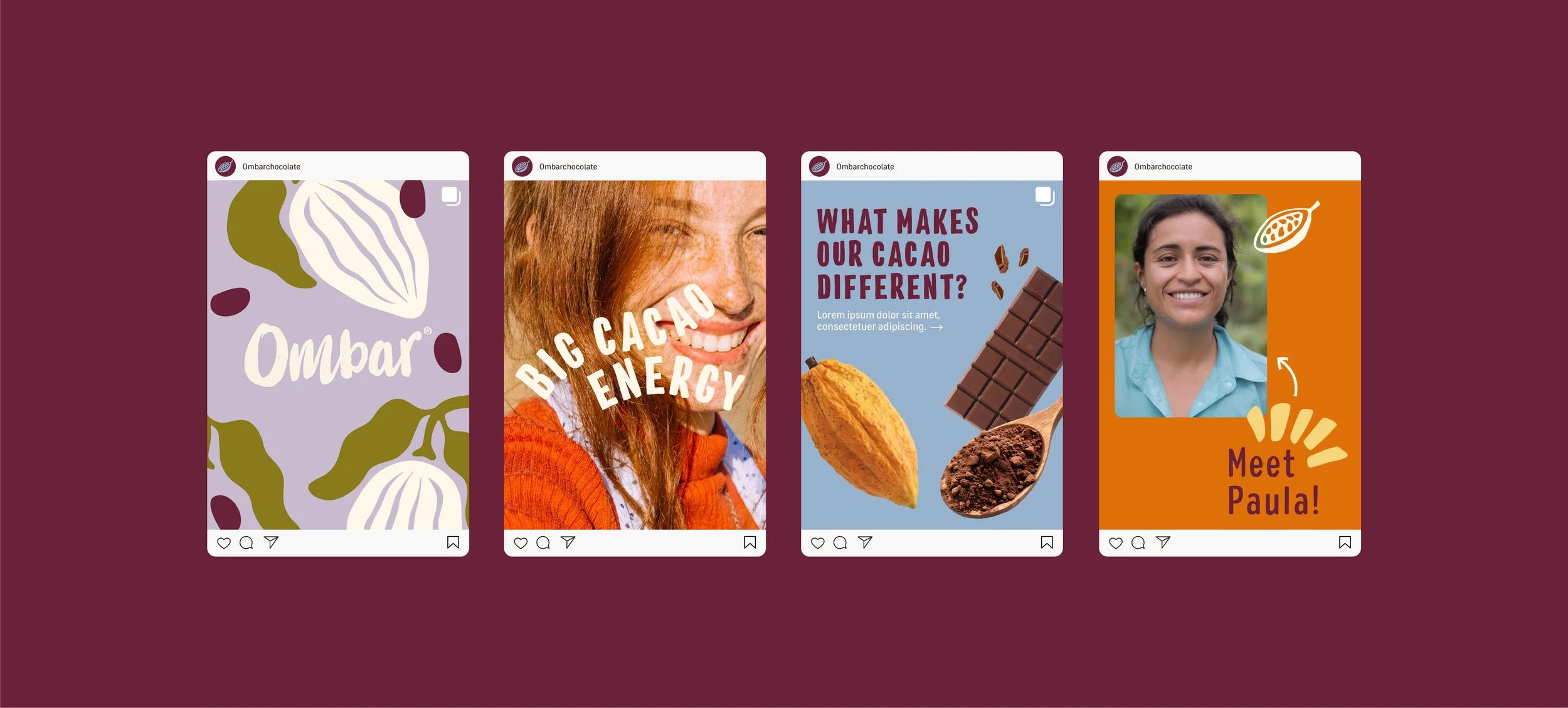
As part of a custom project, we refined the brand from the ground up, developing a more confident and contemporary identity system. This included a more considered typographic hierarchy, a lighter, more expressive colour palette and more consistency across the range. Natural textures and subtle cues to ingredients were retained, but distilled into a more intentional and sophisticated visual language designed to stand out on shelf.
The Result
What was the final result?
The new identity positions Ombar more confidently within the premium chocolate space, balancing its organic roots with a modern, design-led aesthetic. The refreshed system improves shelf presence, strengthens brand recognition, and creates a more engaging experience for both existing customers and a broader, more style-conscious audience.