

Brief
To redesign the packaging to enhance shelf standout and better reflect the brand’s new ‘English Garden’ creative direction. The goal was to bring more charm, colour, and seasonal freshness to the visual identity, evoking the feeling of a garden in full bloom while retaining the brand’s natural, plant-based ethos.
Client
ChicP is a sustainable, feel-good food brand turning surplus vegetables into vibrant, plant-based dips and hummus that are as nutritious as they are colourful.
The situation
What challenge was your client facing?
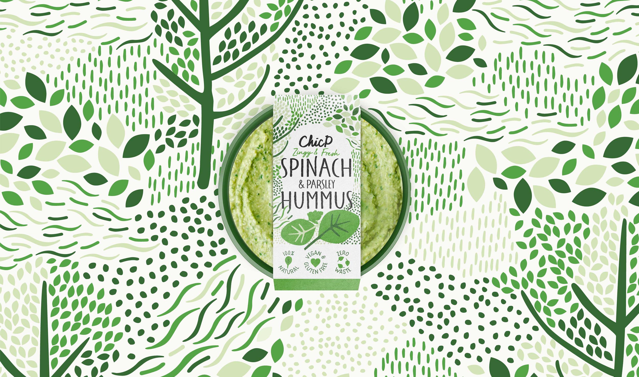
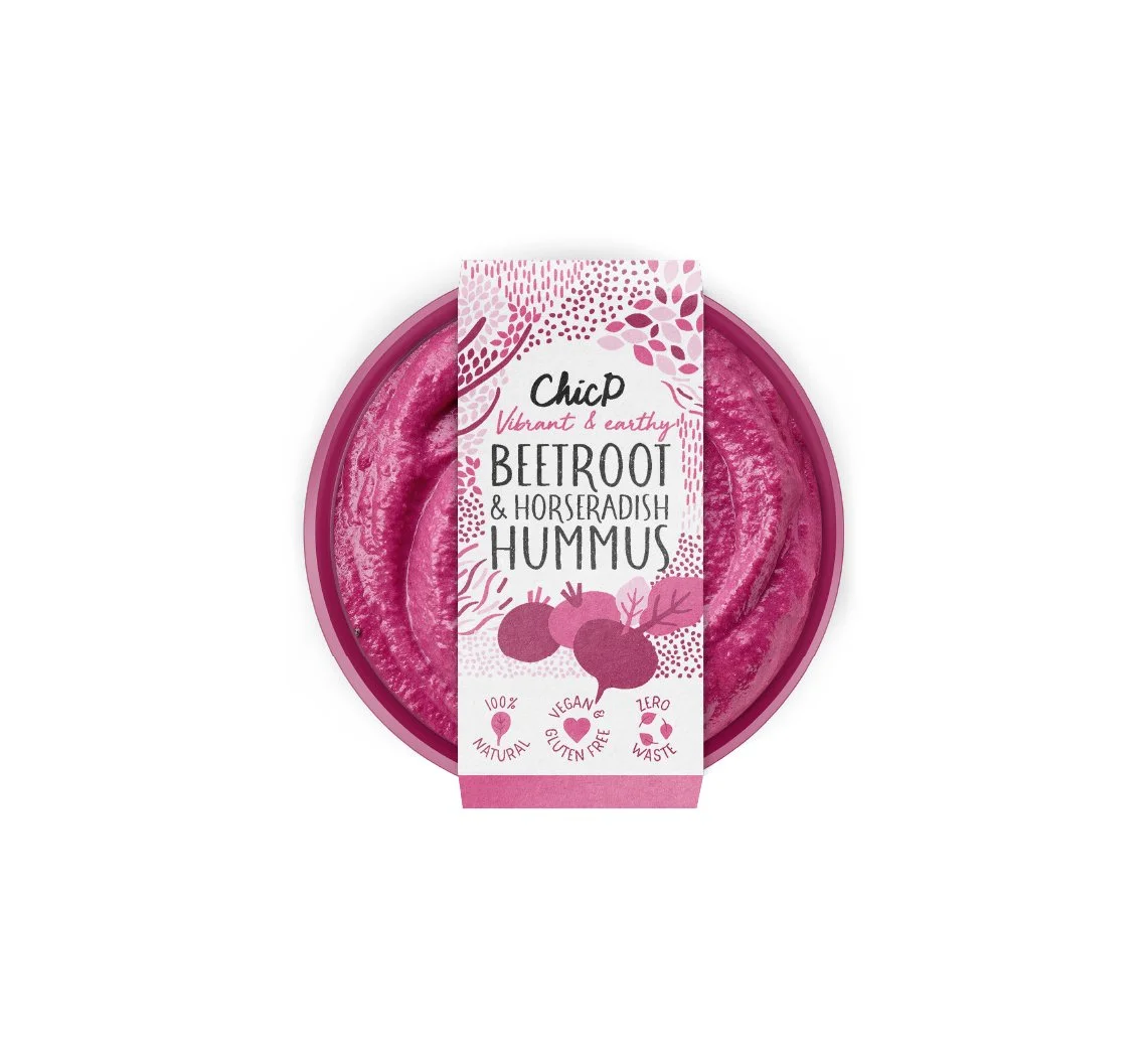
ChicP’s existing packaging wasn’t delivering the standout needed in a competitive chilled aisle, and it no longer reflected the brand’s evolving creative direction. With a new ‘English Garden’ brand positioning, they needed a visual refresh that would capture the charm and vibrancy of the concept. The challenge was to create a look that felt fresh, joyful, and distinctive—without losing the brand recognition they’d already built


Before

After
The Task
What outcome were they hoping to achieve?
They wanted to elevate the brand’s shelf presence and create packaging that would instantly capture attention while clearly communicating freshness, flavour, and sustainability. The goal was to bring the ‘English Garden’ positioning to life visually, evoking natural abundance and seasonal joy, while strengthening brand recognition and driving new customer engagement both in-store and online.

The action
What steps did you take to help them get there?
We combined a bold, eye-catching colour palette with a playful illustration style to capture the feeling of abundant nature and seasonal joy. To improve clarity and impact, we refined the hierarchy and created a suite of custom icons that clearly communicate the product’s key benefits at a glance. Hand-drawn elements, including the illustrations and a textured typeface, bring an artisanal, handcrafted feel that aligns with the brand’s roots. The result is a cohesive packaging system that breathes new life into the brand while staying true to its sustainable mission.

The Result
What was the final result?
The final result is a vibrant, cohesive packaging system with stronger shelf presence, clearer messaging, and a playful yet premium aesthetic. The new design breathes fresh life into the brand, helping ChicP stand out in a crowded category while staying true to its sustainable, plant-based roots.
What our client said
“Working with Freckle gave us hope in the design process again.”
“We loved worked with Freckle! We were really struggling to stay motivated after working with two freelance designers who hadn’t understood our vision and had cost us a lot of money. Luckily Freckle listened to our needs and went above and beyond the scope.”
hannah, founder